Plot Genetic Linkage Maps using MapChart software
Updated:
MapChart is a free software to plot publishing quality genetic linkage maps as well as QTLs. This software was developed at Wageningen University by Roeland E. Voorrips and can be downloaded at this link .
In this tutorial, We are going to learn how to prepare input files and plot the genetic linkage map in the MapChart software. For detail information, please read this article at this link. The software also contains a descriptive manual, please consult it for detailed information.
Step 1: Preparing the Input file
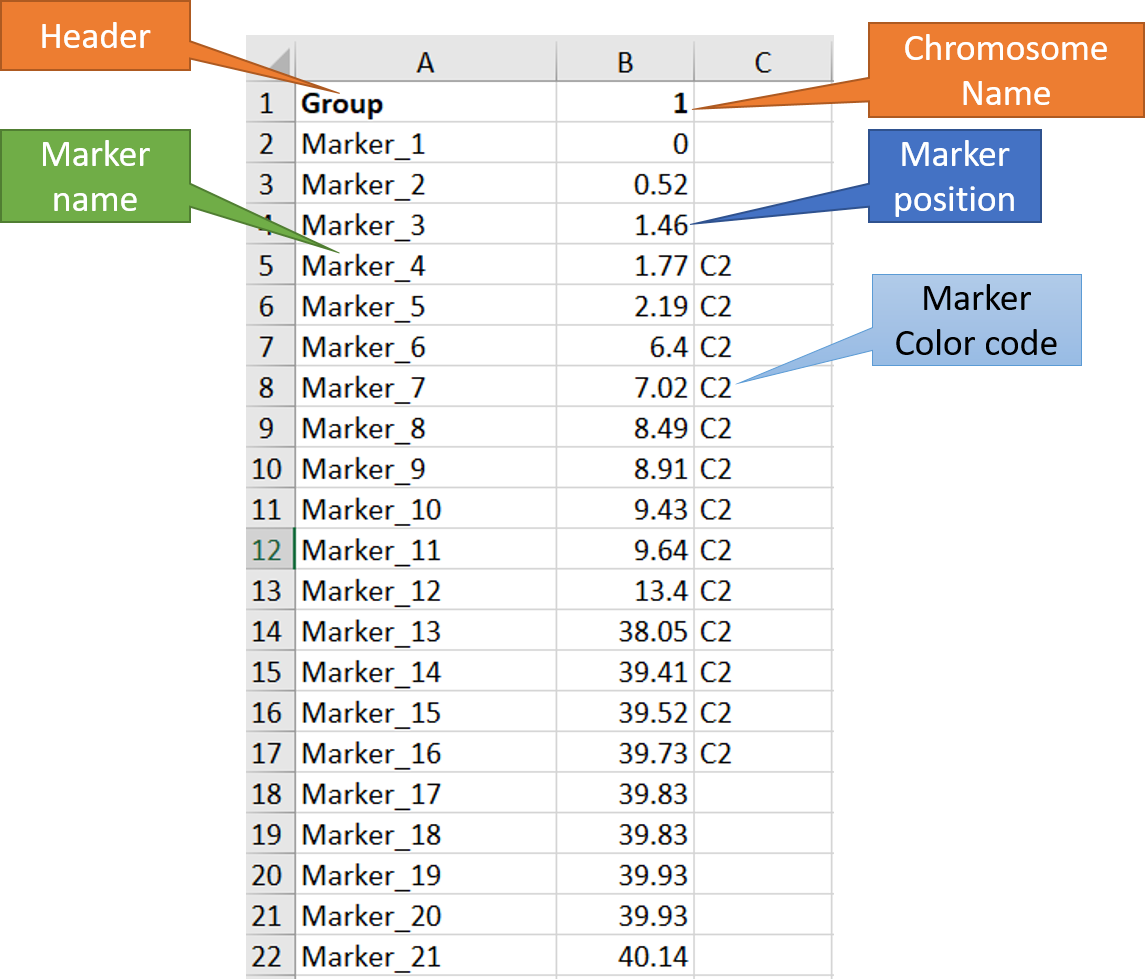
In MS Excel or any relevant software, create the input file as shown in the images below. Please Note third column is optional, which can be used to color code the marker names and position. In this example, I have used C2 to color some markers in the red.
Step 2: Running the MapChart software
1.1 Importing input file
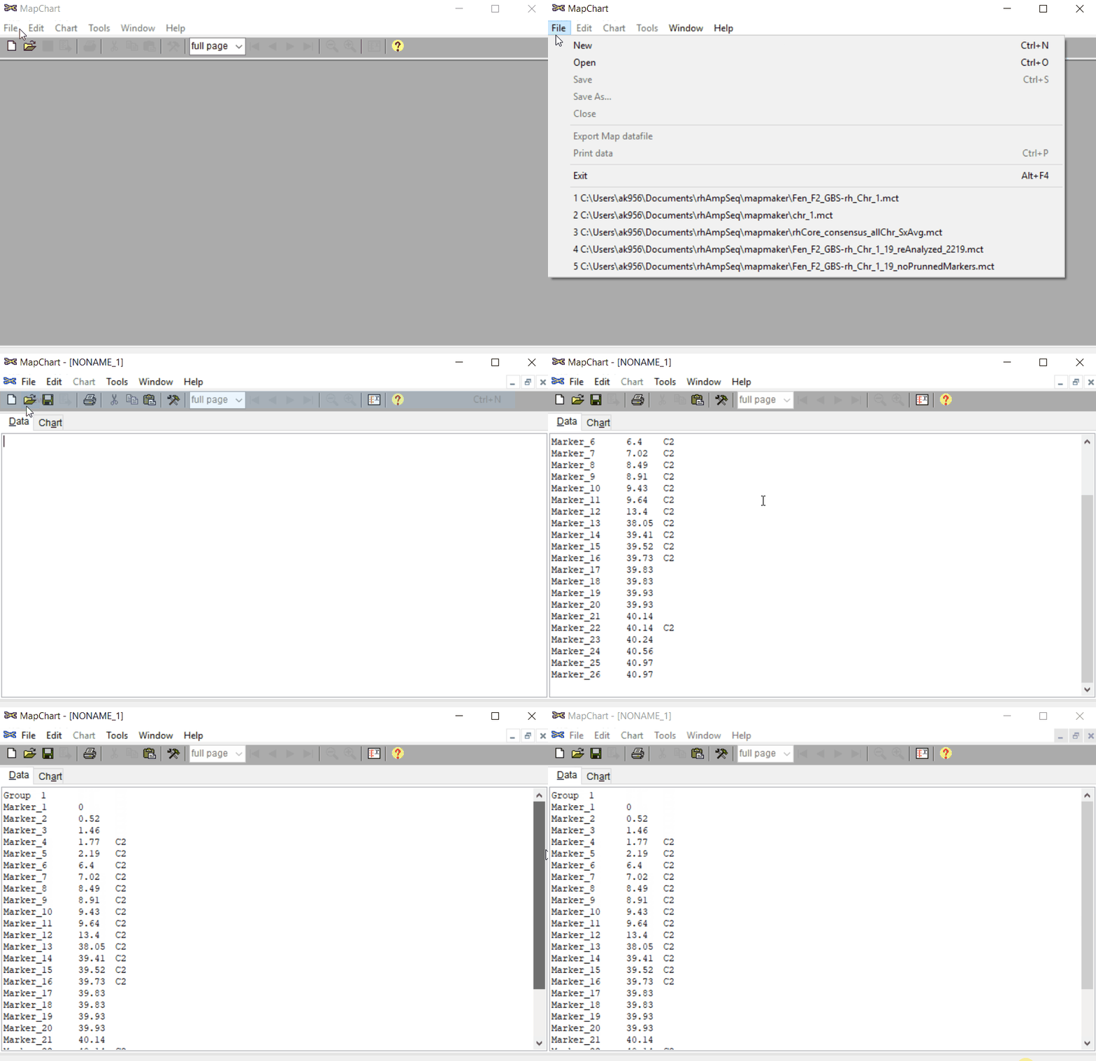
Open MapChart and copy the input data from MS Excel, and paste in the window as shown below. Please note, if you have data for multiple linkage groups or chromosomes then in the same window add those information starting from different line and make sure to have the correct the chromosome number for each Group.
Step: 1.2 Plot maps
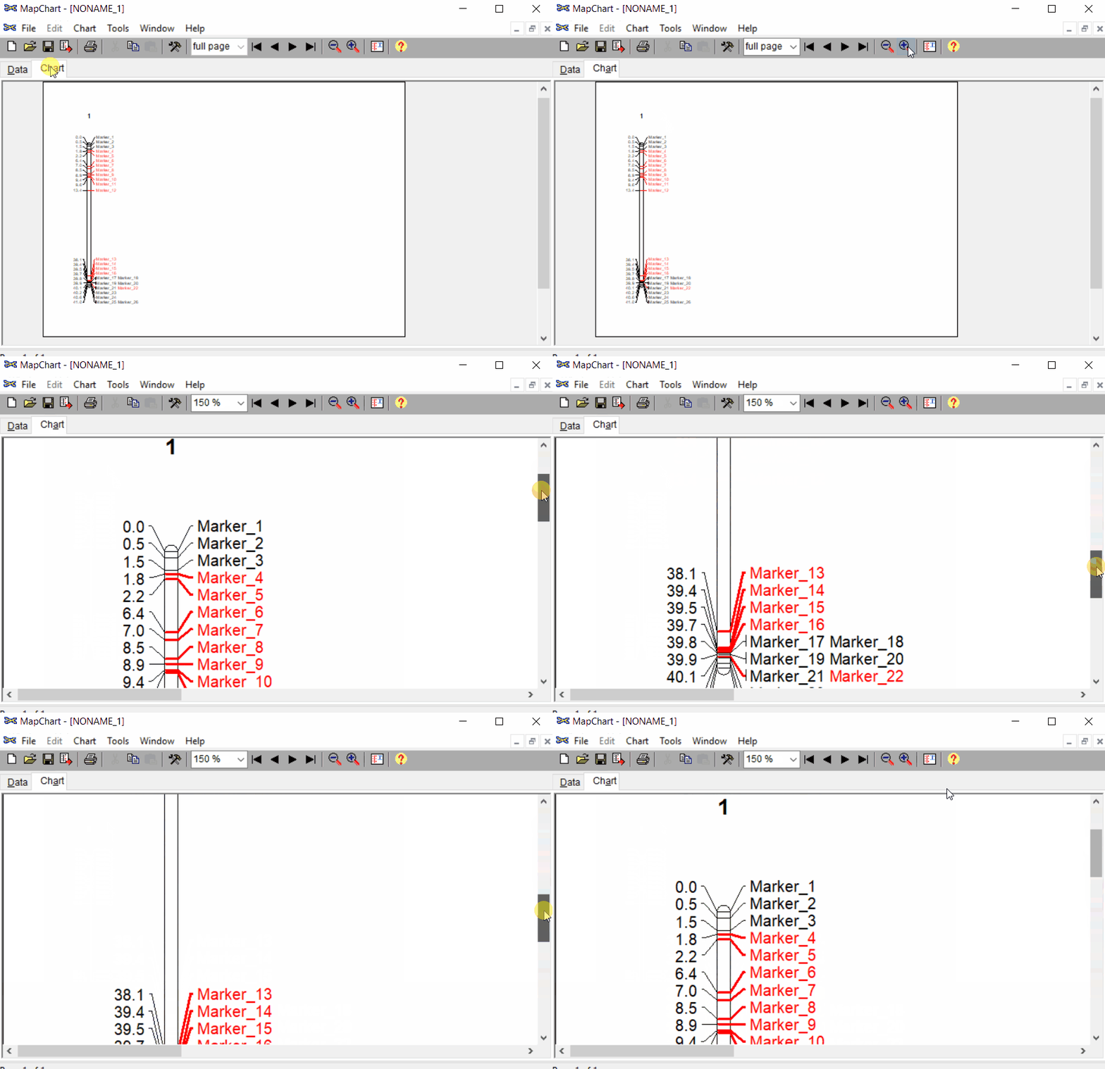
Once the input data are loaded, click chart to plot the map. Follow the steps shown in the below figure to run this step. Once the plot is generated, it can be copied and pasted or saved as a desired format.
Step: 1.3 Formating the plot (optional)
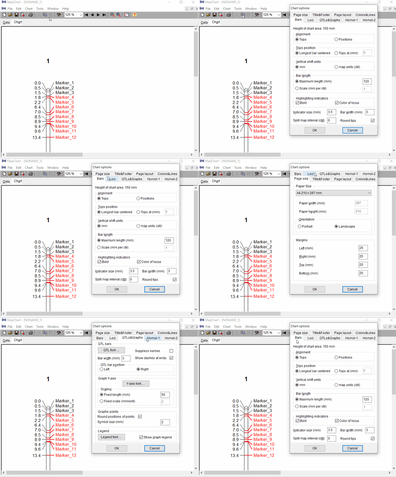
Under the Tools click chart options one can format the plot by choosing the given parameters.
2.0 Extra: Adding QTL results with Linkage Map
To add the QTL scan information by the Linkage map plot, two files are needed:
- Graph file (*.txt)-- It contains the QTL scan information such as: Linkage group or chromosome, LOD score, markers name and their position
- MapChart datafile (*.mct)
Please make sure to save the above two files in the same directory.
2.1 Graph file
An example of graph file is shown below snippet. It should be saved a text file (.txt) The first line of the should contain the below listed headers/column names in the same order:
- Map = the marker position
- Group = Linkage group or chromosome
- LOD = LOD scores of the markers from QTL scan
- Locus = Marker names
Map	Group	LOD	Locus
0	3	0.338142225	3_271381
0	3	0.338142225	3_342741
3.016	3	0.342828507	3_441478
3.016	3	0.342828507	3_1842464
8.692	3	0.995532085	3_609816
8.692	3	0.995532088	3_3385014
8.692	3	0.99554481	3_3633235
8.692	3	0.995559978	3_3781609
8.692	3	0.995559979	3_2314233
13.825	3	1.667949557	3_3143022
15.815	3	2.051705308	3_3905978
15.815	3	2.051705309	3_3488939
20.948	3	2.435239204	3_4019281
20.948	3	2.435239205	3_4088612
21.933	3	3.525018239	3_4315306
21.933	3	3.525018244	3_4565569
21.933	3	3.525018244	3_4822693
27.609	3	4.450683912	3_5155501
27.609	3	4.450683912	3_5232850
27.609	3	4.450683917	3_5507072
30.625	3	5.838195827	3_5583374
30.625	3	5.83819583	3_5699986
30.625	3	5.838219391	3_5797319
30.625	3	6.158922578	3_6000617
30.625	3	6.158930443	3_6426810
30.625	3	6.158983621	3_6986623
30.625	3	6.158983624	3_6650857
33.126	3	5.816798097	3_7155917
33.126	3	5.816798097	3_7220808
33.616	3	6.087780718	3_7472345
36.632	3	7.120904543	3_7742797
40.695	3	7.595581176	3_8256808
40.695	3	7.595581176	3_8738055
40.695	3	7.595581176	3_8604250
40.695	3	7.595581178	3_9374964
45.29	3	9.327503718	3_11252155
45.29	3	9.327503722	3_14850509
48.827	3	11.41099851	3_15846197
48.827	3	11.41099851	3_17712785
48.827	3	11.41099851	3_17950996
50.312	3	10.17917069	3_19297395
50.312	3	10.17917069	3_19690734
2.2 MapChart file (*.mct)
An example file of mapchart file is shown in snippet below.
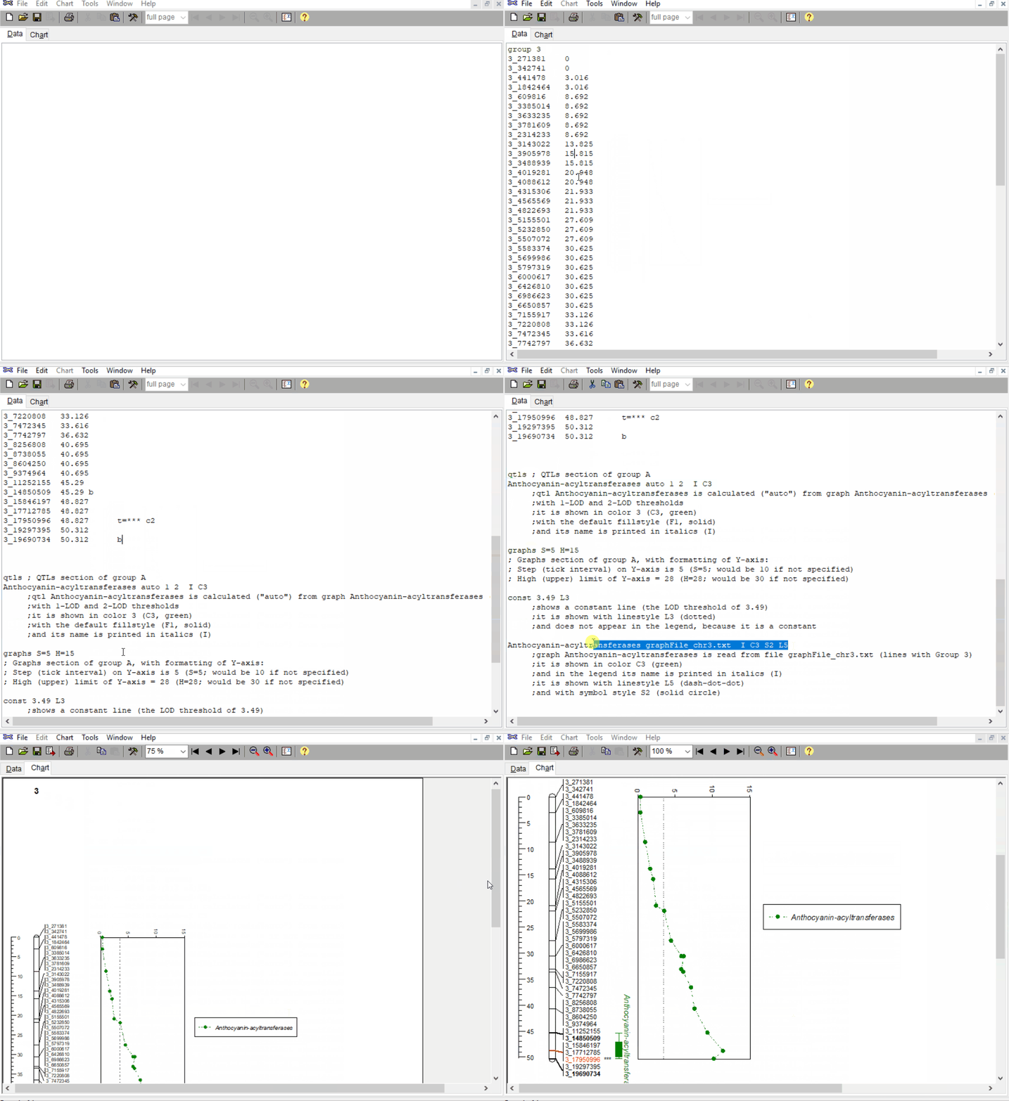
In this file, one can indicate the most significant marker and QTL intervals. For example, in the below snippet, notice that under group 3, I have added t=*** by marker 3_17950996 to highlight the significant marker, similarly, added b by markers 3_14850509 and 3_19690734 to indicate the qtl intervals.
Further, please read the notes (lines beginning with **;**) in the snippet below to learn more about how one add x- and y-axis scale, draw line for LOD threshold and position of candidate gene/s.
group 3
3_271381	0
3_342741	0
3_441478	3.016
3_1842464	3.016
3_609816	8.692
3_3385014	8.692
3_3633235	8.692
3_3781609	8.692
3_2314233	8.692
3_3143022	13.825
3_3905978	15.815
3_3488939	15.815
3_4019281	20.948
3_4088612	20.948
3_4315306	21.933
3_4565569	21.933
3_4822693	21.933
3_5155501	27.609
3_5232850	27.609
3_5507072	27.609
3_5583374	30.625
3_5699986	30.625
3_5797319	30.625
3_6000617	30.625
3_6426810	30.625
3_6986623	30.625
3_6650857	30.625
3_7155917	33.126
3_7220808	33.126
3_7472345	33.616
3_7742797	36.632
3_8256808	40.695
3_8738055	40.695
3_8604250	40.695
3_9374964	40.695
3_11252155	45.29
3_14850509	45.29	b
3_15846197	48.827
3_17712785	48.827
3_17950996	48.827	t=*** c2
3_19297395	50.312
3_19690734	50.312	b


qtls ; QTLs section of group 3
Anthocyanin-acyltransferases auto 1 2  I C3
     ;qtl Anthocyanin-acyltransferases is calculated ("auto") from graph Anthocyanin-acyltransferases (see below),
     ;with 1-LOD and 2-LOD thresholds
     ;it is shown in color 3 (C3, green)
     ;with the default fillstyle (F1, solid)
     ;and its name is printed in italics (I)

graphs S=5 H=15
; Graphs section of group A, with formatting of Y-axis:
; Step (tick interval) on Y-axis is 5 (S=5; would be 10 if not specified)
; High (upper) limit of Y-axis = 15 (H=15; would be 30 if not specified)

const 3.49 L3
     ;shows a constant line (the LOD threshold of 3.49)
     ;it is shown with linestyle L3 (dotted)
     ;and does not appear in the legend, because it is a constant

Anthocyanin-acyltransferases graphFile_chr3.txt  I C3 S2 L5
     ;graph Anthocyanin-acyltransferases is read from file graphFile_chr3.txt (lines with Group 3)
     ;it is shown in color C3 (green)
     ;and in the legend its name is printed in italics (I)
     ;it is shown with linestyle L5 (dash-dot-dot)
     ;and with symbol style S2 (solid circle)
Follow the below steps to open and run the above files in MapChart
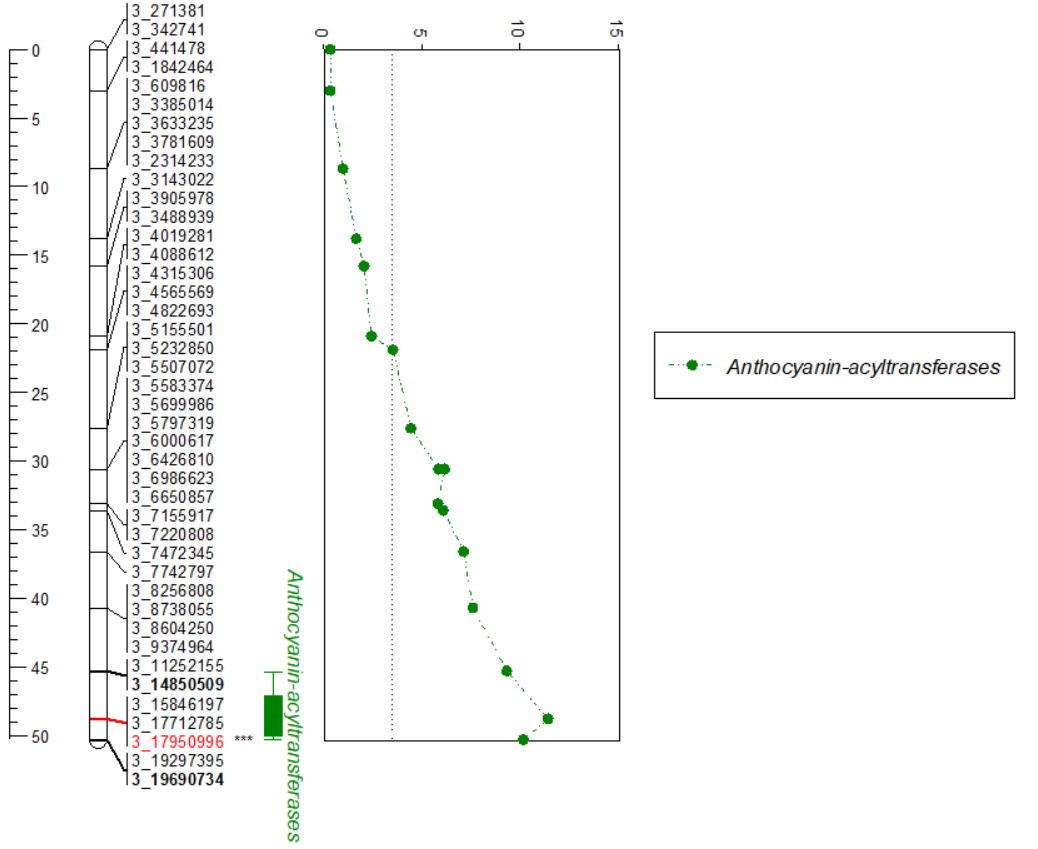
Output
The generated plot can be copied and pasted into any other platforms such as MS Word/Powerpoint and saved.
Thank you for reading this tutorial. If you have any questions or comments, please let me know in the comment section below or send me an email.
Happy plott-ing ![]()
Bibliography
Voorrips, R. E. "MapChart: software for the graphical presentation of linkage maps and QTLs." Journal of heredity 93.1 (2002): 77-78.

Leave a comment